Pricing & Plans
Pricing & Plans
No need to decide now... It's free to get started and simple to turn on capability when you need it and turn it off when you don't.
No need to decide now... It's free to get started and simple to turn on capability when you need it and turn it off when you don't.
Privacy Policy
Privacy Policy
Privacy Policy


Pricing & Plans
No need to decide now... It's free to get started and simple to turn on capability when you need it and turn it off when you don't.


Branding & Marketing Guidelines
Brand Guidelines


We are passionate about our brand and what it represents. We welcome and share our brand with you.
We respectfully request you read and abide by our Brand Guidelines. The main intention is to ensure a clear understanding of how to consistently use our Brand Assets.
The benefits of this are it is easier for people to instantly recognise linkages to foundersfriend and prevents confusion amongst our partners and customers, whilst protecting our Intellectual Property.
.... oh and yes we do know that we should have an apostrophe in our logo. We thought it looked better this way
OUR DO's and DON'Ts


Do:
Use our Brand Assets to refer to foundersfriend, our services or all other services or technologies we offer;
-
Write “foundersfriend” as a one words, and all in lower case ; and
-
Adhere with our Logo Guidelines, Terms of Service and Acceptable Use Policy.
Do Not:
-
Use foundersfriend Brand Assets in a manner that implies a partnership, sponsorship or endorsement by foundersfriend;
-
Present foundersfriend Brand Assets in a way that makes them the most prominent or distinctive feature of what you’re creating;
-
Use foundersfriend Brand Assets in merchandising or other items like T-Shirts, Mugs, caps or items of a similar nature.
-
Assert rights over the foundersfriend brand or Brand Assets, such as domain name registration, trademark registration or any other actions or activities.
-
Integrate the Brand Assets, or anything disorientating similar, into your domain names, trademarks, logos or other such content;
-
Utilise trademarks, trade dress, domain names, logos or other created materials that mimic or could be confused with think;
-
Detail or feature foundersfriend on materials or articles linked with explicit content of a sexual nature, illegal or violent activities and which contravene our Terms of Service;
-
foundersfriend reserves the right to modify our Brand Guidelines, without notice. We will post our most up to date version on our website and you are responsible for adhering to all current terms. It is your responsibility to consistently check these guidelines.
Primary Logo
This is our primary logo, which contains all our logo elements. It should be used most frequently and take priority over secondary logo options.


Our logo consists of different elements, such as a wordmark and a symbol. Together, these elements make up our primary (or “full”) logo, but you can also use some elements on their own, depending on the application.
Logo elements
A
Wordmark
foundersfriend
Yani's Circle
B
A
B

A

Logo Color Options
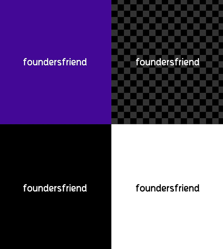
Our logo has four different color options for use on different backgrounds and applications. The four options are: Coloured with background, white on transparent, white on black, black on white.
A

Logo Color Options
Our logo has four different color options for use on different backgrounds and applications. The four options are: Coloured with background, white on transparent, white on black, black on white.
Logo Color Options
Our logo has four different color options for use on different backgrounds and applications. The four options are: Coloured with background, white on transparent, white on black, black on white.
A

Primary Color Palette
These are the primary colors used in our logo. Refer to these color codes when communicating with designers or printers, or choosing font and background colors for branded assets.

Secondary Color Palette
This is our secondary color palette, which complements the primary colors used in our logo. Refer to these color codes when communicating with designers or printers, or choosing font and background colors for our branded assets.

Typography
Our logo uses one typeface. Pur company name typeface is Berkslund Bold.

Impact Color Pallette
This is our impact color palette, which complements the primary colors used in our logo. Refer to these color codes when communicating with designers or printers, or choosing font and background colors for our branded assets.

Typeface Family
This is the typeface family used in our logo.
berksland_bold.jpeg)
Unacceptable Typography Uses
Below are some examples of correct typography usage, as well as common errors. Use this as a guide when using typography on branded assets like your website or brochures.
A. The default letter spacing works best which is usually around 0 and the line height should be 1.5x your font-size.
B. This example has poor letter spacing. Makes the content look cramped and hard to read.

Grid
This is the grid used to design our logo.

Logo Clear Space
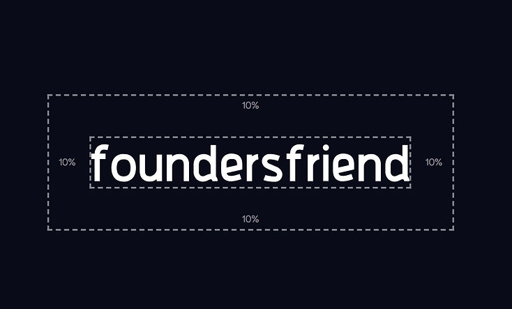
Clear space is the smallest distance allowed between our logo and other graphic elements or text. Wherever our logo is used, it should be surrounded by a consistent amount of clear space to ensure visibility and impact. The clear space is developed from 10% of the total width of our logo. Nothing should invade this zone!


Logo Clear Space
When using our logo on an image background, add a black layer on top with 40% transparency to create contrast.

foundersfriend

Unacceptable Logo Usage
Changing any element of our logo weakens our brand. This page shows a few examples of unacceptable ways to display our logo.
Please Do not:
A. Put our logo on a similar or low-contrast background color.
B. Put our logo on images with low contrast; add a black layer
with 60% transparency if needed.
C. Effects: Don’t add effects like drop-shadows or outlines to your logo.
D. Violate our logo’s “clear space” with text or graphics.
E. Change the color of any of our logo elements.
F. Make our logo semi-transparent or hard to view.
G. Stretch or distort our logo when scaling it.
H. Rotate our logo or display it on an angle.

Contact Our Marketing Team
We are passionate about sharing our brand and our story to the broader community. We are supportive, helpful and always encouraging so please reach out.